Reviews and recommendations are unbiased and products are independently selected. Postmedia may earn an affiliate commission from purchases made through links on this page.
When asked to work on a High Park mansion built in 1910 that retained many of its rich Edwardian details, Toronto designer Vanessa Ferro knew it would be a balancing act. The current owners, who both happen to be historians, were attracted by Ferro’s talent for creating stylish traditional interiors that honour their roots.
Where to draw the line between historic accuracy and modern sensibilities is an ongoing debate among designers and architects. At what point does a period restoration become a stage set or theme-park version of itself? And, on the other hand, how far should you go to adapt an old house for the century we’re living in?
Vanessa Ferro’s design work arrives at a satisfying answer. Using the home’s handsome millwork, stained glass, hardware and other details as a starting point, she carefully recreated the charm and elegance that it might have had when new while also making it functional and liveable for a 21-century family.

The owners gave Ferro a mandate when they engaged her services: refresh and update the house, especially the kitchen, but maintain, restore and even accentuate the home’s period details as much as possible.
According to one of the owners, the house was originally built by a prosperous coal merchant and agent for his family, who lived in it for its first 30 years or so. The home passed through several hands in the ensuing decades but managed to escape the fate ofmany similar homes of its size in the neighbourhood: being chopped up into rooms for rent.
“The house still has many of its original features, including all its doors, its two-button light switches, original doorbell, original floors (and) windows. We have one of the few original brick barn-door coach-house-type garages left in the neighbourhood, with its own chimney. So this place is really special to us.”

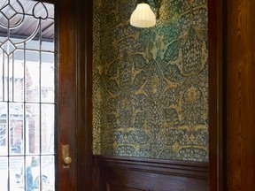
The balancing act is apparent as soon as you enter the front vestibule, with its original handsome stained-glass door, hardwood flooring and low-key millwork. Herethe goal was to accentuate the entrance just enough to bring out the character without overpowering it. The hardwood — impractical for snowy winters — was replaced with ceramic tile in a pattern that is in tune with 1910; simple wainscoting stained to match the rest of the woodwork achieves the desirable always-been-there look.

Ferro says she considered William Morris wallpaper for the upper walls, which would have been the height of fashion at the time and is readily available in reproduction today, but opted instead for a similar period-style pattern that picks up the colouring of the tile. “Adding an authentic William Morris pattern would have been too on-the-nose,” she says. In other words, it’s a home, not a museum.
The Anaglypta wallpaper that lines the walls of the front hallway was probably added by a previous owner but was in perfect condition, so Ferro chose to paint it in a shade that picks up the colours in the vestibule tile. “The Anaglypta paper adds texture and colour without adding another pattern; there’s already a lot of wallpaper in the house, so it acts as a kind of visual relief,” she notes. The cozy leaf-patterned stair runner updates the traditional Turkish-style pattern but has a gently Arts-and-Crafts motif, consistent with the period of the house.

Powder rooms are a good example of an amenity that was virtually unknown in early twentieth-century homes but are considered a necessity today. The existing room had previously been carved out of a front hall closet with a leaded glass door and original door handle and plate. Beadboard wainscoting and white fixtures act as supporting players to the new marble mosaic tile flooring with a black and mahogany edge pattern; whimsical “hidden key” wallpaper is a classic motif that recalls the spirit of the original.
The owner laughs that the dining room would be right at home on the set of Murdoch Mysteries, one of the family’s favourite shows. Ferro polished up the room’s formality and elegance by adding an Oscar de la Renta wallpaper with an elaborate thistle and leaf pattern. Such an assertive paper requires an equally bold window treatment; she points out that there are six separate elements in the draperies, from the two-fabric panels to the sumptuous rope-and-tassel tiebacks.
By far, the room that received the greatest transformation was the kitchen. “The previous owners had made it look old-fashioned, with Heartland appliances and so on,” says the owner, adding that it was really uncomfortable to work in.

The room was chopped up, cramped and had no flow. The solution was to remove an awkwardly placed window, which freed up a long wall and allowed the designer to rework the layout almost from scratch.
This also helped to reorganize the room’s relationship with the large mudroom-pantry that connected the kitchen to the garden. To unite the two rooms, she added a black-and-white tile floor — a period touch — and a blue-and-white colour scheme, reversing the colour of the cabinets in the pantry. Wallpaper — a fresh toile for the kitchen, and a small-scale diamond leaf pattern for the pantry — add a cheerful finish with just the right touch of early 20th-century-style sweetness.
“In the end, the balance I try to strike with every project is to know when it’s right to live in the 21st century and when you should preserve,” observes Ferro. “But it still has to work for you; you have to have comfort and function in your home, after all.”